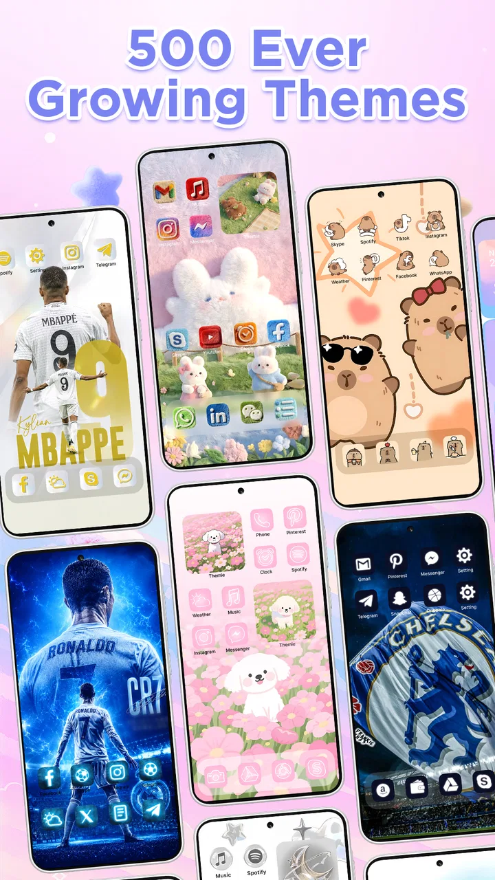
Themie: Wallpapers & Themes
- 4.6
- Rating
- 10.00M
- Installs
- Free
- Price

 Analysis by App-foxy
I installed Themie to see whether it could make the Android home screen feel deliberately designed rather than simply decorated. This free personalization app from SebastianBona brings themes, wallpapers, and widgets into one place, which sounds straightforward, but the real test is how smoothly those pieces move from browsing to a usable daily setup. My starting point was a familiar one: a phone that worked perfectly but looked visually disconnected, with a wallpaper I had stopped noticing and home-screen elements that felt placed by habit.
Themie is aimed at solving that small but surprisingly persistent problem. Instead of switching between a wallpaper app, a widget tool, and the launcher settings, I could treat the home screen as one visual project. That approach is the app’s strongest idea. It is less about adding a single pretty image and more about giving the phone a consistent mood. The result depends on how much time you want to spend refining the handoff between the app and Android’s own home-screen controls.
From an ordinary home screen to a complete visual setup
I found that the most useful way to judge a home-screen makeover is to ask how quickly it gets me back to what I meant to do. In this section, I look at the pace of browsing and setup, then at the moments when choosing several visual elements can make the process feel slower. The aim is to distinguish a satisfying bit of customization from a workflow that starts competing with everyday phone use.
You May Also Like

 Pandora - Music & Podcasts
Pandora’s Music Is Easy to Start, but Harder to Recover
Pandora’s strength is its low-effort path from a seed to a station. Its weak spot is how much confidence it asks you to place in connection, setup, and quiet recovery.

 AccuWeather: Weather Radar
AccuWeather Review: A Quick, Clear Forecast for Everyday Decisions
For everyday plans, the best forecast is the one you can understand quickly. AccuWeather makes rain timing, radar, and local conditions easy to act on, with a few trade-offs.

 Hill Climb Racing
Why Hill Climb Racing Still Turns Crashes Into One More Run
A tiny car, a bumpy hill and one more upgrade: Hill Climb Racing keeps resurfacing because its simple chaos makes every near-miss feel personal.

 AliExpress - Shopping App
AliExpress Makes Global Shopping Feel Personal, but Shoppers Bear the Risk
AliExpress turns a global marketplace into a pocket-sized discovery engine. Its reach is useful, its shopping loop compelling, and its trade-offs easy to miss.

 Lords Mobile: Kingdom Wars
Lords Mobile Is a Kingdom-Building Routine, Not a Quick Match
A case-by-case verdict on the building, battles, device demands, and social commitments that make Lords Mobile rewarding for some players and exhausting for others.

 PDF Scanner app - TapScanner
TapScanner Makes Paperwork Easier to Capture, Check, and Share
TapScanner makes scanning with a phone feel less like a rescue operation and more like a dependable step in getting work done. Its capture tools are useful, though not flawless.
More From Our News Desk
View All News


Choosing a starting point without losing control
The first useful decision is deciding whether you want a complete look or only one ingredient. If your current icons and layout already work well, changing just the wallpaper may be enough. If the screen feels messy, a broader theme gives you a more coherent starting point. I found it helpful to begin with the visual element that bothered me most instead of immediately applying everything available.
That matters because a full makeover can create new friction. A dark wallpaper may look excellent in a preview but make small text harder to read. A busy background can compete with app labels, while a minimal design may leave a widget looking too prominent. I recommend treating the preview as a composition check: look at the empty areas, the position of the clock, and the space where your most-used apps will sit, not only at the artwork itself.
The app’s store summary focuses on customizing the home screen with aesthetic themes, wallpapers, and widgets, and that combination accurately describes its role. It is a personalization tool rather than a replacement for the phone’s basic launcher. That distinction is important for anyone expecting a completely different operating environment. Themie helps shape the surface of Android, but the familiar behavior of the phone remains part of the experience.
Building the screen in a sensible order
My preferred workflow starts with the wallpaper, continues with the widget, and ends with the app arrangement. The background establishes contrast and color. The widget then becomes the main functional accent, and only after that do I decide which apps deserve the most visible positions. Reversing this order often leads to compromises, such as moving important icons because the chosen image has a bright area underneath them.
There is also a practical reason to avoid changing everything at once. If the finished screen feels wrong, you can identify the cause more easily when each decision has a clear place in the process. A wallpaper that looks good alone may be the wrong choice once a large widget is added. Similarly, a widget that seems attractive in isolation can make the first screen feel crowded when combined with a full row of shortcuts.
A useful trick is to keep the first page focused on the actions you perform repeatedly and use the theme as a frame around them. I would not sacrifice quick access to messaging, maps, banking, or work tools merely to preserve visual symmetry. The best result is not the most empty screen; it is the one where the design supports the way you already use the phone.
Understanding the handoff to Android
Themie’s job does not end with selecting a design. The chosen elements have to become part of the home screen through Android’s normal customization behavior. This handoff is where expectations should be realistic. A wallpaper can be visually ready while the final crop, icon placement, or widget position still depends on the device and launcher.
I treated each application step as a preview of the intended result, not a guarantee that every phone would display it identically. Different screen proportions can change how a background is framed. System text, notification indicators, and launcher spacing can also affect the balance. If your phone offers a final preview before applying a wallpaper or widget, use it carefully and check the screen in both bright and dim conditions.
This is one of the app’s less obvious trade-offs: centralizing the design process is convenient, but the final authority still belongs to Android. That is not a flaw unique to Themie, though it does mean the cleanest result may require a small amount of manual adjustment afterward. I consider that reasonable for a personalization app, provided you are comfortable checking the result rather than assuming the preview tells the whole story.
Making widgets useful instead of decorative
Widgets are where the workflow can become more than a wallpaper change. I prefer using one widget that earns its space, such as a glanceable element that helps me decide what to do next, rather than filling the screen with several decorative blocks. A widget should reduce the number of taps or make information easier to notice. If it only adds color, it may be better replaced with a smaller visual accent.
Placement deserves more attention than most theme browsing encourages. Put the widget where your thumb and eyes naturally reach it, then arrange the surrounding icons around its actual footprint. A design that looks balanced in an editor can feel awkward if the widget sits just beyond comfortable reach. This is especially noticeable on larger phones, where the top half of the screen can become visually attractive but practically inconvenient.
I also recommend checking whether the widget remains legible against the selected wallpaper. A translucent or lightly colored design can disappear over detailed artwork. When that happens, choosing a calmer background is usually more effective than trying to compensate by adding more elements. The strongest Themie setups I tried were restrained: one clear focal point, enough empty space for labels, and a background that supported rather than challenged the information layer.
Passing from visual design to everyday use
Here is the everyday scenario where the app made the most sense for me. I wanted a calmer home screen before a busy week, but I did not want to reorganize every app or learn a new launcher. I selected a restrained theme, placed a practical widget near the area I check most often, and kept my existing app habits. The outcome was not a dramatic change in how the phone worked; it was a reduction in visual noise each time I unlocked it.
That distinction helps set the right expectation. Themie can make a phone feel refreshed without changing your routines, but it cannot fix an overloaded app drawer, poor notification habits, or a confusing folder structure by itself. I still had to decide what belonged on the first page. The app provided the visual framework; I supplied the discipline about what stayed visible.
What happens when the first result is not right
The first applied design should be treated as a draft. After living with it for a while, I noticed details that were easy to miss during browsing: a background that made labels less distinct, a widget that drew attention away from the apps I actually needed, or spacing that felt less comfortable when using the phone one-handed. These are not reasons to abandon the app. They are reasons to refine the setup in stages.
My advice is to change one variable at a time. Replace the wallpaper before moving the widget, or resize the widget before rebuilding the icon layout. This turns trial and error into a manageable workflow. It also prevents the common mistake of applying a second complete theme simply because the first one had one weak element.
For people who enjoy matching their phone to a season, hobby, room, or personal color palette, this iterative approach is part of the appeal. For someone who wants a single permanent arrangement with no experimentation, the browsing and adjustment may feel unnecessary. Themie rewards a little visual curiosity more than it rewards complete automation.
How it compares with the usual alternatives
The usual alternative is to assemble the same result from separate sources: one app for backgrounds, another for widgets, and the launcher’s own settings for placement. That method can offer more specialized control, especially if you already have a favorite widget provider or a launcher with extensive layout options. Its downside is the handoff between tools. Colors may not match, sizing can become inconsistent, and you have to remember where each part came from.
Themie’s advantage is the single-workflow mindset. It is easier to begin with a mood and then build around it than to collect unrelated pieces and hope they cooperate. The compromise is that a dedicated specialist may still be better for a particular task. Someone who cares mainly about advanced launcher behavior, highly specific icon control, or a deeply customized layout may prefer separate tools that focus narrowly on those areas.
I would also separate it from a full launcher replacement. Themie is a better fit if you like your phone’s existing navigation and want to improve its appearance. If your goal is to change gestures, app-drawer behavior, page transitions, or the entire interaction model, a launcher designed for those functions is the more suitable choice. The app’s value is in coordinated personalization, not in replacing Android’s home environment.
Practical details before installing
The app is free to install, while in-app purchases range from under a dollar to just under twenty dollars per item. That makes it easy to try without committing immediately, but I would still pay attention to which parts of your intended setup require an additional purchase before investing time in a particular visual direction. A free starting point is useful, yet the most appealing combination may not be included in the no-cost experience.
It is rated for Everyone, and the minimum operating-system requirement is Android seven or later. That makes it accessible to a broad range of Android phones, although compatibility on paper does not guarantee identical visual results across every launcher and screen shape. I would check the final appearance on your own device before planning a large redesign around a specific preview.
The current version is 26.0, and the app was released on October 19, 2025. Its public reception is strong, with an average rating of 4.5 from around 110 thousand ratings, alongside over ten million installs. Those figures suggest that the basic concept has broad appeal, but they should not replace your own judgment about how much customization you actually want. A popular app can still be the wrong match for someone who prefers an untouched home screen.
Where the flow breaks down
The biggest weakness is the gap between visual intention and final device behavior. A theme may appear perfectly balanced in the app, then need adjustment once Android applies the wallpaper or the launcher places the widget. That extra step is manageable, but it means the experience is not entirely one-tap. Users who are sensitive to exact alignment may find themselves spending longer than expected on small corrections.
There is also a risk of choosing style over usability. A beautiful background can reduce contrast, and a large widget can consume space that would be more valuable for frequently used apps. Because the app makes visual discovery enjoyable, it is easy to keep browsing instead of asking whether a design will remain comfortable after a week of ordinary use. My strongest recommendation is to judge the result at the moment you need to act, not only when you are admiring the home screen.
Another limitation is that a unified theme does not automatically unify every part of the phone. The home screen may look polished while notification panels, settings pages, and individual apps retain their own appearance. If you want a system-wide visual transformation, this app alone may not deliver that feeling. It works best when you are satisfied with improving the part of the phone you see most often.
Who should use it and who should skip it
I recommend Themie to someone who wants a noticeable visual refresh without replacing the familiar Android experience. It is particularly useful if you have a wallpaper, widget, and icon arrangement that currently feel unrelated, or if you enjoy trying different moods while keeping your everyday apps in the same places. The combined workflow saves effort compared with collecting each visual piece separately.
I would be more cautious about recommending it to a person who dislikes tweaking, expects every preview to transfer perfectly to the device, or needs highly specialized launcher controls. In those cases, a simpler wallpaper-only app or a dedicated launcher may create less friction. It is also not the right solution if the real problem is an overcrowded app layout; you will still need to make those organizational decisions yourself.
After using it as a complete input-to-outcome process, I see the app as a practical design layer for Android rather than a magic makeover button. The best results come from treating the theme as a framework for your habits, not as a substitute for them. Choose the background with readability in mind, give widgets a functional job, check the final handoff on your phone, and adjust one element at a time.
That balance is why I would recommend trying it. The free entry point makes experimentation approachable, the category is clear, and the combination of themes, wallpapers, and widgets is more convenient than juggling unrelated tools. Just keep your expectations grounded: the final screen still needs your decisions, and the most attractive setup is not always the most usable one. For a phone that feels visually tired but functionally fine, Themie is a worthwhile way to make the daily unlock feel intentional again.
FAQs for Themie: Wallpapers & Themes
01What features does Themie: Wallpapers & Themes offer?
Themie provides a vast library of high-quality wallpapers and a variety of themes to customize your device. Users can choose from categories like nature, abstract, and minimalist designs. It also offers dynamic wallpapers that change with time or weather conditions, providing a fresh look throughout the day.
02Is Themie: Wallpapers & Themes free to use?
The app offers a free version that includes basic wallpapers and themes, but for access to premium content, users may need to make in-app purchases or subscribe to a membership. The premium version includes exclusive designs, ad-free experience, and early access to new features and collections.
03How user-friendly is the Themie app interface?
Themie is designed with a simple and intuitive interface, making it easy for users to navigate through different categories and themes. The app supports straightforward browsing and applying of wallpapers with just a few taps, ensuring a hassle-free experience for users of all ages.
04Does Themie affect device performance or battery life?
Themie is optimized to ensure minimal impact on device performance. While dynamic wallpapers might use slightly more battery, the app is designed to be lightweight. Users can adjust settings to balance aesthetics with battery efficiency, ensuring a smooth experience without significant battery drain.
05Can I use Themie wallpapers on both Android and iOS devices?
Yes, Themie is available for both Android and iOS platforms. The app is designed to provide a seamless experience across different devices, allowing users to enjoy a cohesive look no matter which operating system they are using. Simply download from Google Play or the App Store.
Pros
- Vast selection of high-quality wallpapers.
- Easy-to-use interface for customization.
- Regular updates with new themes.
- Supports dynamic wallpapers for variety.
- Compatible with most devices.
Cons
- Contains ads that can be intrusive.
- Limited features in the free version.
- Occasional app crashes reported.
- Some themes require in-app purchases.
- Large app size may affect storage.

Themie: Wallpapers & Themes
Gallery